
Data Visualization & Storytelling with Python
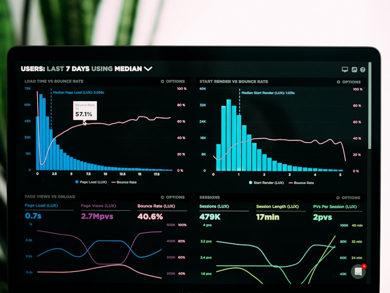
This one-day course teaches you how to create compelling data visualizations with Python. You'll master Matplotlib, Seaborn, and Plotly, learn design principles for effective charts, and discover how to tell stories with data. Includes hands-on exercises with real-world datasets.
Skills You'll Learn
Course Modules & Lessons
Matplotlib & Seaborn Fundamentals
Plot types, customization, styling, color palettes, and publication-ready charts
Matplotlib Grundlagen
Figure, Axes, Subplots und grundlegende Plots erstellen
Diagramme anpassen
Labels, Titel, Legenden, Farben und Styling
Seaborn für statistische Plots
Boxplots, Violinplots, Heatmaps und Pairplots
Publikationsreife Charts
Farbpaletten, Schriften und Export in hoher Auflösung
Interactive Visualizations with Plotly
Interactive plots, animations, 3D charts, and Plotly Express for rapid prototyping
Plotly Express Schnelleinstieg
Interaktive Charts in einer Zeile Code
Plotly Graph Objects
Volle Kontrolle über Traces, Layouts und Animationen
3D-Visualisierungen
3D Scatter, Surface Plots und Kamerasteuerung
Animierte Charts
Zeitreihen animieren und interaktive Slider
Data Storytelling Principles
Chart selection framework, annotation techniques, color theory, and narrative structure
Das richtige Diagramm wählen
Entscheidungsframework: Welcher Chart für welche Frage?
Annotationen & Callouts
Wichtige Datenpunkte hervorheben und beschriften
Farbtheorie für Daten
Sequenzielle, divergierende und kategorische Farbskalen
Narrative Struktur
Datengeschichten aufbauen: Setup, Konflikt, Auflösung
Dashboard Creation
Building interactive dashboards with Plotly Dash, layout design, and callbacks
Plotly Dash Grundlagen
App-Struktur, Layout-Komponenten und erste Dash-App
Callbacks & Interaktivität
Input/Output-Callbacks und State-Management
Layout & Design
Bootstrap-Komponenten, Tabs und responsive Layouts
Dashboard deployen
Render, Railway oder Heroku für Dash-Apps
Prerequisites
Your Trainer

David Pinezich
Experienced IT architect and trainer specializing in Python, Cloud Architecture, and Enterprise Solutions. Certified TOGAF, CISSP, and AWS professional with years of hands-on training experience.